
What a Knowledge Graph Sees That We Cannot
How an LLM map of online discourse is rewriting what’s possible in conflict analysis, and why everyone living through the digital age should pay attention.

The post you scroll past in two seconds
A grainy video. A casualty number. A hashtag. An accusation aimed at a name you half-recognise. You keep scrolling.
That single post you barely registered is a node. The account that wrote it, the actor it blames, the place it names, the emotion it weaponises, the hashtag it rides — those are nodes too. And the invisible threads connecting them to thousands of other posts saying nearly the same thing, in nearly the same way, at nearly the same time — those are the relationships.
You can’t see the network from inside a feed. Nobody can. A trained human analyst, working flat out, can read and code maybe 100 posts a day. The machinery of online discourse produces that volume in roughly the time it takes to make coffee.
That gap, between what is being said and what any one person can possibly notice, is where information warfare lives.
A knowledge graph closes the gap.
What we actually built, and what it actually saw
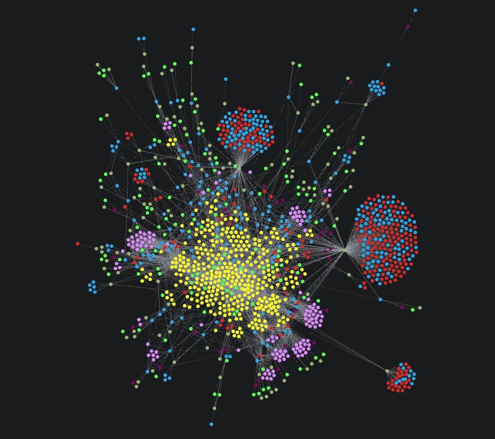
In March 2025, the Syrian coast became the site of mass violence. Within hours, the digital response was larger than any team could read. BrainBridge Solutions, in partnership with Konrad-Adenauer-Stiftung Lebanon, processed roughly 100,000 social media posts and comments through a large-language-model pipeline that converted raw discourse into structured, queryable architecture.
The result was a graph of 3,087 nodes connected by 22,376 relationships: every actor named, every event described, every recurring rhetorical pattern, every hashtag, every location — and every directed link between them. Not a stack of quotes. A map.
What the map revealed was not a louder version of what humans already suspected. It was something different in kind.
71.7% of the massacre-related content was flagged for hate speech. Not the loud minority. The baseline.
93.9% of discourse around the documented massacres was framed in sectarian or aggressive tones. Empathy, neutrality, mourning — combined — accounted for 6.1%.
The Assad Regime received a polarisation score of 0.974: of 387 mentions, 382 assigned blame. Closed narrative consensus.
Hayat Tahrir al-Sham, by contrast, scored 0.296: a live narrative battle, still in progress, where neither account had won.
Israel was invoked almost evenly by both sides: strategic deployment, not grounded attribution.
And most importantly: the system identified 524 distinct discourse patterns and 373 narrative types, including 22 structurally separate variants of the Sectarian Hate Campaign.
That last number is worth pausing on. A human reading 100 posts would notice that sectarian rhetoric is prevalent. The graph identified twenty-two architecturally different ways sectarian rhetoric was being deployed — some attributing collective guilt to Alawites, some to Sunnis, some invoking historical massacres to frame current ones as ethnic cleansing, some pairing inflated casualty claims with genocide accusations.
The difference between “sectarian rhetoric is prevalent” and “there are 22 distinct, structurally organised hate campaigns running in parallel” is the difference between weather and a weather map. One is something you complain about. The other is something you can plan around.
The deeper lesson: structure is the story
The most important idea in the Knowledge Graph Manual isn’t a metric. It’s a philosophy.
The graph is discourse-centric, not user-centric. It does not track individuals. It strips usernames, removes URLs, anonymises sources. It is built to see patterns, not people. What it captures is the architecture of collective speech: who blames whom, in what tone, with what casualty claim, alongside what other actors, in what places, under what hashtags.
This matters because the harm of information warfare is rarely a single post. The harm is the configuration. It is one thing to note that a community is being attacked online. It is another to discover that the attacks follow 22 distinct structural templates, that they cluster on four specific cities (which together account for 78% of all geographic mentions), and that the same community is simultaneously the most-defended group in the dataset and one of the most-targeted by hate speech.
A close reader can describe a discourse. A graph can diagnose it.
Why this should matter beyond Syria, beyond conflict, beyond academia
Three lessons emerge that have nothing to do with one country, one conflict, or one moment.
1. The volume problem is universal, and now it has a solution.
Anyone trying to understand a public conversation at scale faces the same wall: humans cannot read fast enough. This is true for conflict analysts, but it is also true for journalists tracking a disinformation wave, for brand managers facing a reputation event, for public-health teams monitoring vaccine narratives, for election officials watching for coordinated voter intimidation, for human-rights organisations documenting hate campaigns before they become atrocities. The methodology demonstrated here is a general-purpose lens. The specific application was conflict; the underlying capability is observation at machine scale.
2. Quantification is the precondition for accountability.
There is a real fear that turning discourse into numbers flattens it. The graph does flatten some things: sarcasm, irony, sincere versus performative outrage. But quantification also enables something previously impossible: thresholds. When the baseline hate-speech rate is 71.7%, a movement to 85% in the days following a new incident is a signal that can be acted on. A signal that can trigger a counter-narrative campaign, a humanitarian alert, a diplomatic intervention, before the next round of violence, not after.
You cannot regulate, intervene in, or even meaningfully discuss what you cannot measure. The graph makes information environments measurable. That is a quiet revolution.
3. The future belongs to humans and machines working together.
The system identifies 524 patterns. It cannot tell you which one matters most for next week’s policy decision. The machine computes a polarisation score for HTS. It cannot explain why that score’s specific trajectory matters for accountability dynamics in post-Assad Syria. A data scientist builds the graph. A regional analyst interprets it. A communications strategist translates the interpretation into intervention.
This is the analytical equivalent of giving every Syria expert a telescope they did not have last year. The expertise is the same. The visible sky is wider.
What we should take from this (whatever field we’re in)
If you work in policy, this is your early-warning system finally becoming real. Hate-speech rates, polarisation scores, and pattern-emergence metrics can be tracked continuously. The retrospective analysis of one massacre becomes the live monitoring of the next.
If you work in media or research, this is a model of what reproducible, ethical, scaled discourse analysis can look like: privacy-preserving by design, with every metric regenerable from the source data.
If you work in technology, this is a reminder that the highest use of large language models is not to generate plausible text but to make the invisible visible: to extract structure from the chaos human eyes were never built to process.
And if you work in none of these, if you are simply a person who scrolls, reads, votes, and worries about the state of the public square, this work is a quiet promise that the architecture of online manipulation is not destined to remain hidden. It can be mapped. And what can be mapped can be challenged.
The closing thought
The most haunting line in the methodology is also the most hopeful. The graph externalises what would otherwise remain distributed across thousands of disconnected observations, making the total structure of discourse queryable and measurable.
The online-narratives that hurt us collectively (coordinated dehumanisation, narrative weaponisation of real violence, the slow erosion of empathy beneath an avalanche of sectarian framin) have always operated at a scale beyond individual perception: For the first time, we the defenders can catch up.
This article reflects on findings from The Promise of AI in Conflict Analysis and the accompanying Knowledge Graph Manual, produced by BrainBridge Solutions LTD in partnership with Konrad-Adenauer-Stiftung Lebanon. Full access to the database is available upon request.